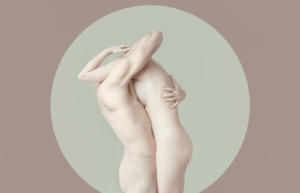
Drafting Futures: The Intersection of Psychology, Aesthetics, and Creativity in Interior Design
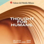
Exploring the Role of Emotional Resonance in Shaping Tomorrow’s Spaces at Salone del Mobile Milan 2025
At the heart of this year’s Salone del Mobile lies an evolving discourse about the future of interior design, where the confluence of psychology, aesthetics, and creativity is reshaping the way we perceive, experience, and inhabit spaces. The theme Drafting Futures invites us to reflect on how interior design transcends mere functional structures, becoming an emotional and intellectual experience that draws from the depths of human psychology and creative expression.
As the design world progresses, it becomes evident that the role of design is not confined to visual appeal alone. Today, spaces are being crafted to engage the human psyche, to evoke emotions, and to establish a profound sense of connection between the occupant and their environment. This pursuit of emotional resonance—rooted in the nuanced field of environmental psychology—is now as critical as the materiality and form of the space itself.
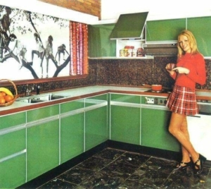
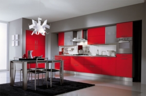
The relationship between psychology and interior design is a delicate dance of elements. The careful orchestration of color, light, texture, and spatial layout can influence the mood, productivity, and even the physical well-being of those who interact with these spaces. It is in the subtleties of design that we begin to see how spatial perception shapes our experience. A thoughtfully designed room, for instance, can instill calm and relaxation or foster creativity and focus, depending on how elements like proportion and scale are manipulated.
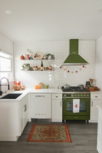
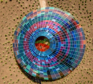
The aesthetic dimension of this psychology-infused design is far from superficial. It goes beyond visual beauty and delves into how aesthetic choices affect human perception and behavior. The rise of biophilic design, for example, is not just about introducing natural elements into urban interiors but also about tapping into the inherent human need to connect with nature. Materials such as reclaimed wood, stone, or living plants are not merely decorative—they offer tangible psychological benefits that reduce stress and enhance cognitive function. This is where the emotional intelligence of design plays a pivotal role: creating spaces that nurture the soul while attending to the functional demands of modern living.
Furthermore, creativity remains a cornerstone of this dialogue. As designers, we are asked not only to craft aesthetically pleasing environments but to create spaces that are imbued with meaning, that tell stories and invite imagination. The intersection of creativity and psychology in interior design allows for the exploration of cognitive ergonomics—design that adjusts not just to the user’s physical comfort, but to their emotional and mental needs. Whether through the fluidity of curved lines that encourage relaxation or the interplay of light and shadow that evokes mystery, design becomes a medium for creative storytelling. Every choice, every material, every form holds the potential to communicate something deeper than function alone.
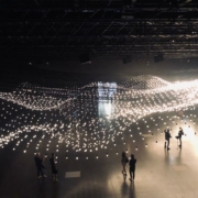
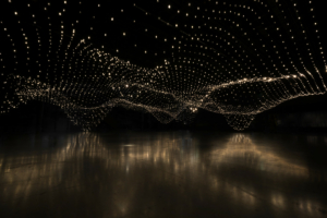
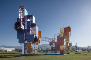
At Salone del Mobile Milan 2025, this interplay between psychology, aesthetics, and creativity will be explored through a myriad of installations and discussions. It is an invitation to consider how design can function as a catalyst for transformation. How can spaces foster an emotional connection that resonates on a deeply personal level? How can designers harness the power of creativity to transcend traditional notions of beauty and function, and instead, offer immersive environments that impact the mind, body, and spirit?
As the conversation moves forward, it is clear that the future of interior design is one of heightened awareness—of the psychological power of space, of the responsibility to create environments that go beyond aesthetics, and of the endless possibilities for creativity. This evolving approach not only challenges us to rethink how we design but also compels us to ask why we design. The spaces of tomorrow will no longer be just physical shelters but sanctuaries that engage us intellectually, emotionally, and socially.
In a world that is increasingly complex and interconnected, interior design stands at the crossroads of technology, nature, and human experience. As we draft the future of design, the focus must remain on creating spaces that reflect our shared humanity, spaces that not only respond to the changing needs of the individual but resonate with the collective soul. The dialogue at Salone del Mobile Milan 2025 will undoubtedly serve as a catalyst for this transformative journey, where design becomes not just a discipline but a force for meaningful change.
Yana Pireva

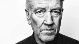


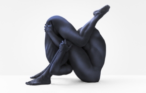
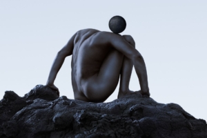
 umental installation, realised in collaboration with the City of Milan, entitled ‘Tired Man’ tells of the ethical fatigue of Strong Sex.